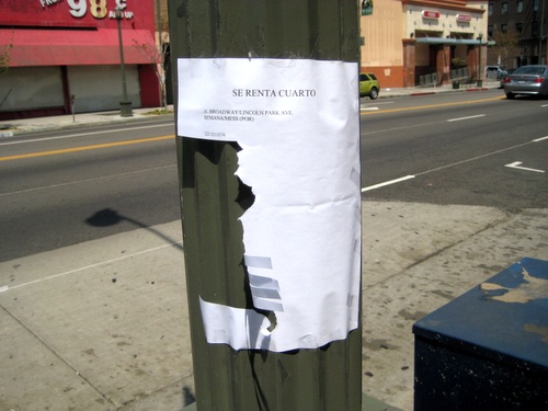
There’s always pole signs in LH but as of late I’ve noticed more than the usual. Normally it’s the same sign over and over, no doubt by some real estate agent with multiple units. Nowadays it’s usually someone trying to rent out a room in a house or apartment, and the lack of sign making experience shows. People just trying to make ends meet aren’t that interested in design. I particularly like those with the least amount of info and with odd minimal use of paper space. Like the beauty above: Maria rents apartment, call her. Succinct.
Two more signs after the jump.
Considering how much space is left over on this one, you think they would have at least added more phone number tabs until they reached the bottom. But maybe this is intentional design?
Instant classic! Don’t know what it is, but it’s for rent.
BONUS! BONUS! BONUS!
Not in LH, not about rooms for rent, but I really loved this curved phone # and cutting action. The wording says alot as well.
That is all.


 Chanfles RSS Feed
These make me so sad.
“yamar” … spanish for “kall”
Annika,
Really? Why?
I don’t know Annika, but reasons the above post could be depressing. People in general are really picky at who they let stay at their house. They usually go through relatives, friends, no I mean friends, friends of friends and then relatives. To put something out on the street is pretty much a sign that you really, really need the money and if you don’t get someone you’re going to be out on the streets or at least taking residence in a single. With the economy going the way it is, well chances are the money these places are asking for is going to be too much to keep their heads above water.
The last one is sad, because people don’t hire you to take care of their kids and clean their house through looking at handwritten signs on a tree and again, this is a person who is about to have a very, very hard time.
Of course I’m negative, but that could be why it’s sad. Falling down the economic ladder can be sad, but in the moment it is not so sad. I remember living with my mom in a one bedroom (roommate didn’t pay,) then in a motel (job thing didn’t work out,) then in a car (social services gets a little picky about a kid living in the car with you) and then I remember getting dropped of in Seattle and then I didn’t see her. I think something like the above happened to her. It wasn’t so sad it was an adventure to me (keep in mind I had a very vivid imagination and I made up all kinds of cool stories of where she could have gone and all of the cool things we were going to do when she came back,) but it could be sad with the right perspective and if you are an adult with poor suspension of disbelief skills.
Browne
New to your blog. Your perspective make me think of ‘negative space’ in art language. Focusing on the space around and in between what is meant to be the focal point. These signs are like that as well.
The people who made the signs work for me at the swapmeet es Maria, Concha y Refujo…lol